Lunar Link
Speculative mobile UI exploring UX in unfamiliar off-worlds
environments
on Jupiter’s moon, Callisto.
Project Specs
Role
Lead Designer
Project Scope
UI/UX Design
Tools Used
Figma
Deliverables Links
Figma Prototype,
Slide Deck
Timeline
3 Weeks
Completion Date
December 2024
Overview
Lunar Link is a conceptual mobile app created as a speculative design project, set in a possible future beyond Earth imagined in the year 2050. The goal was to use a speculative setting to guide design choices while applying practical UI/UX methods.
Developed individually, the project involved defining features, wireframing, planning a sitemap and user flow, building a design system, and creating a high-fidelity prototype in Figma.
Problem Statement
How might we use speculative environmental conditions to inform and guide feature planning and interface design for a mobile experience?
Design Process
Speculative Setting & Design Implication
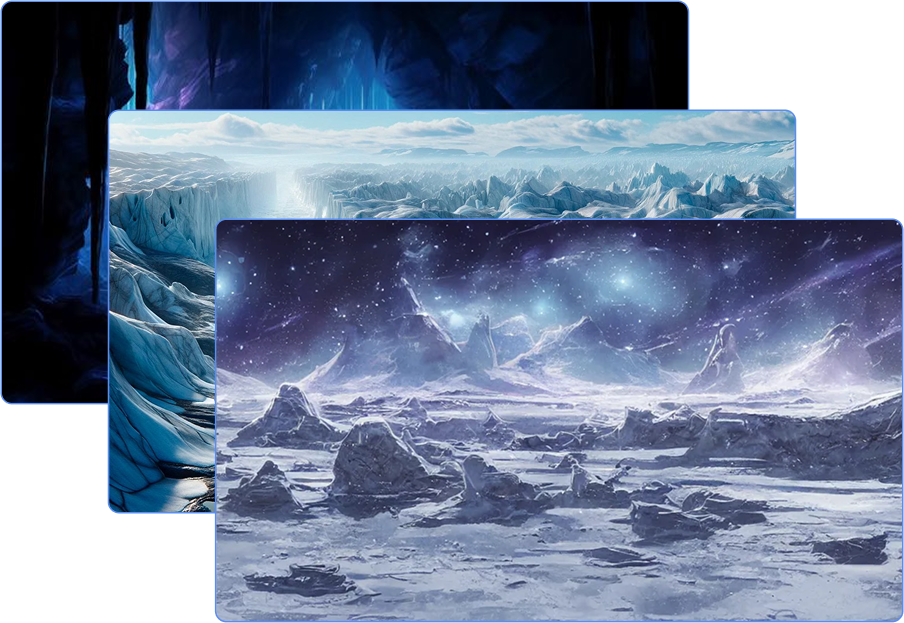
To frame the app’s purpose, a speculative environment was established on Callisto, the third-largest moon of Jupiter. This frozen world experiences extreme cold, lacks a stable atmosphere, and is exposed to intense radiation.
This setting provided a foundation for identifying potential user needs in such an unfamiliar environment, guiding both feature planning and interface design through a speculative yet grounded lens.
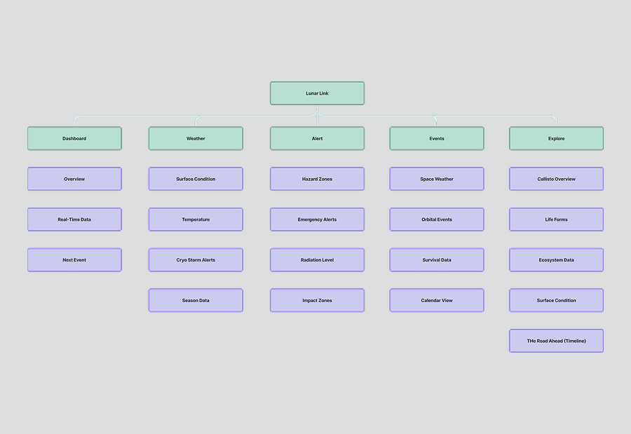
Sitemap Overview
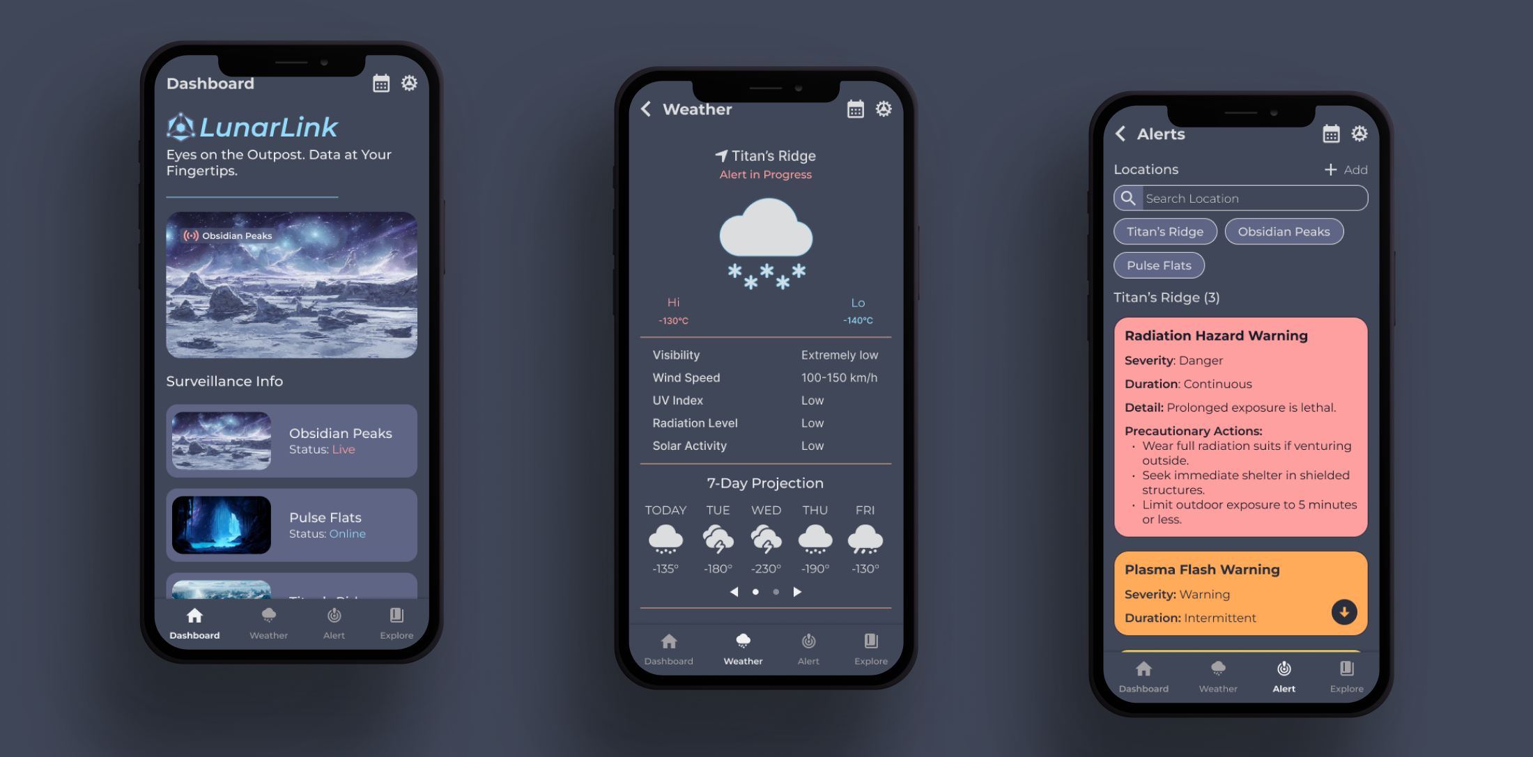
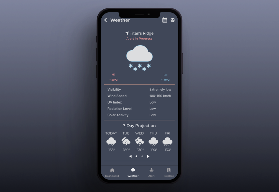
A sitemap was created during early planning to define the app’s structure and inform decisions around navigation and content flow. Organized around five core sections — Dashboard, Weather, Alerts, Events, and Explore — this framework provided a logical hierarchy and helped maintain clarity throughout development.
While some elements evolved during development, the sitemap provided an initial blueprint for navigation and ensured the app’s primary functions were grounded in user relevance.
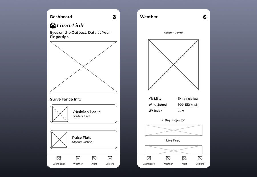
Structure & Layout (Wireframes)
Grayscale wireframes were developed to explore layout, visual hierarchy, and navigation without stylistic distractions. These early drafts allowed for testing interactions and adjusting elements before applying color or branding.
The wireframes mapped out five key sections, Dashboard, Weather, Alerts, Events, and Explore, reflecting user priorities defined during early planning.
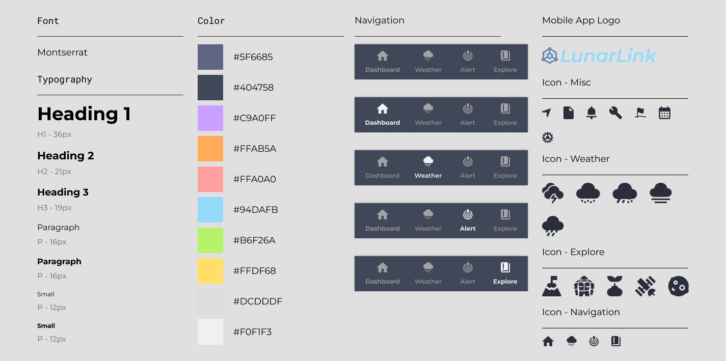
Design System
Developed to ensure consistency throughout the app’s design, the system included core elements such as typography, color, navigation (with active link highlights), icons, and the app logo, all supporting the envisioned features and functionality.
Montserrat was chosen for its readability and geometric form, paired with a soft, muted color palette to ease visual strain. Icons were kept bold and simple for fast recognition within a compact mobile interface.
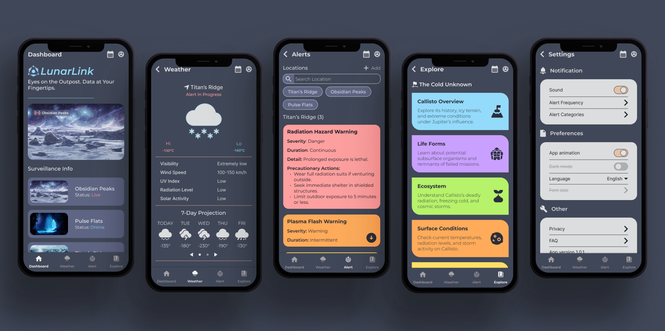
High-Fidelity Design
The final prototype refined the wireframes into an interactive, high-fidelity design using the established system. Visual elements reinforced hierarchy and clarity, while navigation and layouts emphasized usability.
Outcome
This project explored how concept driven environments can inform design decisions. Beginning with imagined user needs, the process focused on creating a usable, coherent interface rooted in real-world design practices. The final prototype balances speculative thinking with functional clarity.