Micro UX Enhancements
Enhancing the user experience by resolving
common interface issues through focused design improvements.
Project Specs
Role
Lead Designer
Project Scope
UI/UX Design
Tools Used
Figma
Deliverables Links
Figma Prototype,
Slide Deck
Timeline
3 Weeks
Completion Date
November 2024
Overview
CanadianProtein Micro UX Enhancements is an academic project that revisits specific sections of an existing e-commerce site. The focus was on addressing practical interface issues that affected ease of use, with small layout changes to improve everyday interactions.
Wireframes and high-fidelity mockups were created in Figma to explore solutions, supported by a lightweight design system built from the site’s existing visual elements.
Problem Statement
How might we improve overlooked interface details to create a smoother, more seamless shopping experience?
Design Breakdown
Identifying Usability Issues
Several friction points were identified across key areas of the website, where interface issues disrupted navigation and made everyday tasks more complex.
The sections below highlight three specific pain points and how each was addressed through targeted layout and interaction changes.
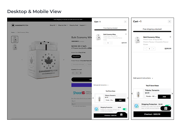
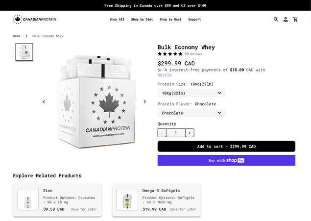
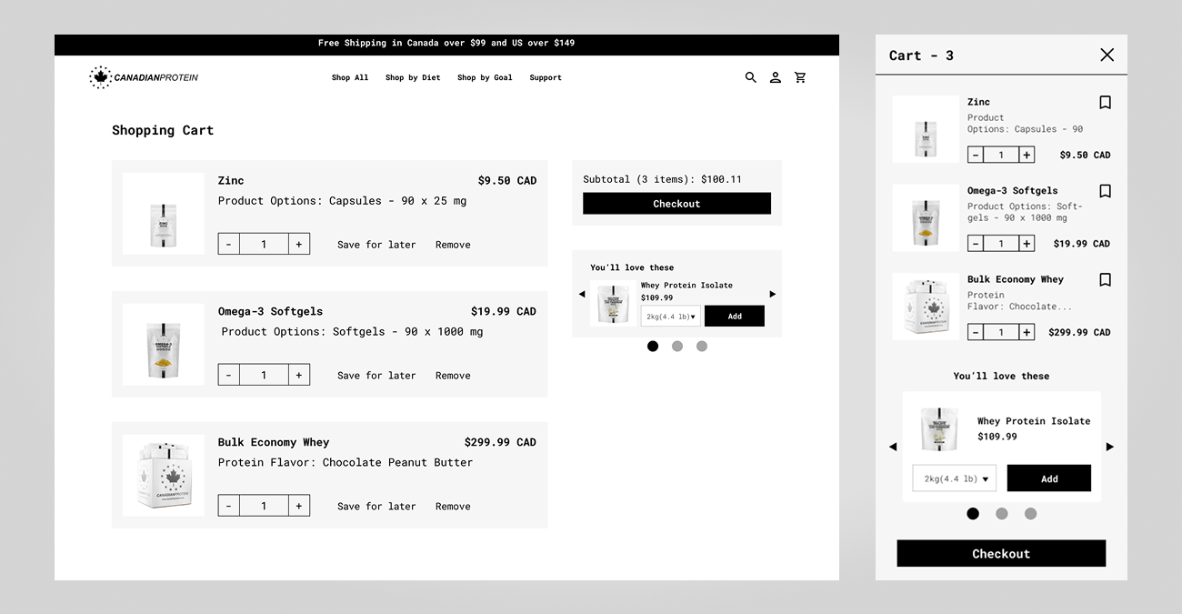
Pain Point 1: Cluttered Cart
Problem:
The shopping cart overlay is visually dense, featuring an
auto-added shipping protection option and overlapping elements
like the rewards button.
Solution:
Both the shipping protection option and rewards button were
relocated to the checkout page, removing unnecessary
distractions from the cart view. The cart layout was also
expanded to full-screen on desktop to reduce clutter and
provide a clearer, more focused experience leading into
checkout.
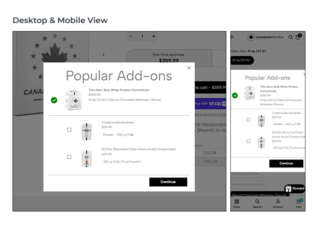
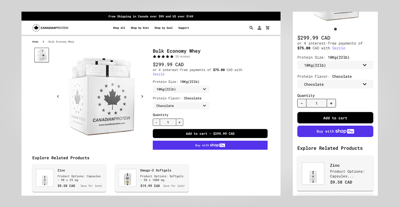
Pain Point 2: Disruptive Popup
Problem:
When a product is added to the cart, a popup featuring
“Popular Add-ons” interrupts the shopping flow. Users must
manually close the overlay before continuing, which breaks
focus and introduces unnecessary friction.
Solution:
Removed the popup entirely. Related product suggestions are
now integrated directly into the product page layout, allowing
users to discover add-ons naturally without disrupting their
browsing experience.
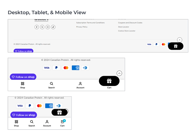
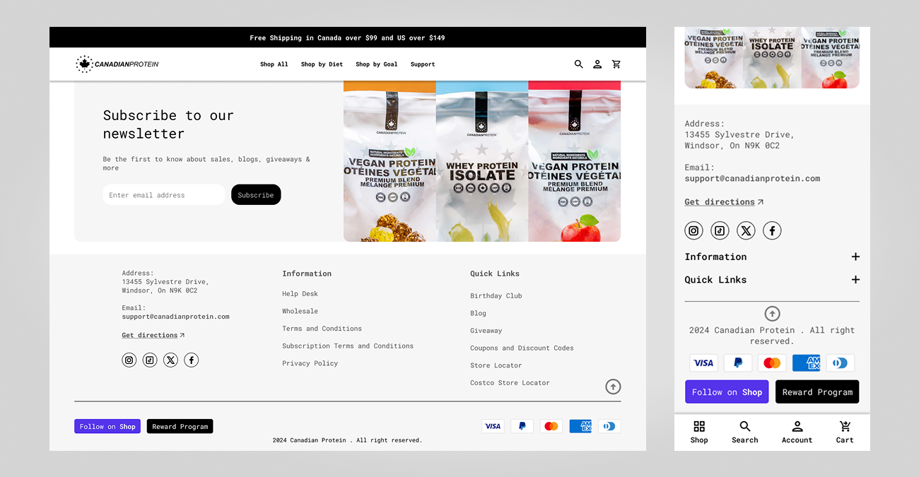
Pain Point 3: Inconsistent Footer Buttons
Problem:
The footer buttons are poorly positioned. On desktop, the
“Scroll to Top” and “Rewards” buttons are too close together,
creating a cluttered appearance. On mobile, the rewards button
covers the scroll control, and on tablets, it overlaps key
navigation elements.
Solution:
Repositioned the rewards button to the left side of the footer
for consistency. The scroll-to-top button was relocated to a
fixed, unobtrusive position on mobile, ensuring it remains
accessible across all device types.
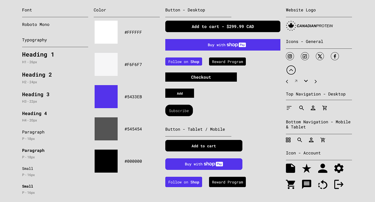
Design System Reference
The design system was based on key UI elements from the original CanadianProtein website to preserve brand consistency. This included typography, color scheme, button styles, and icons. These elements were used as a foundation to refine the layout and ensure the redesign stayed true to the site’s established identity.
Wireframe Proposals for Improvement
Low-fidelity wireframes for desktop and mobile showing layout changes to address key usability issues. These designs focus on improving structure and interactions before finalizing the visual design.
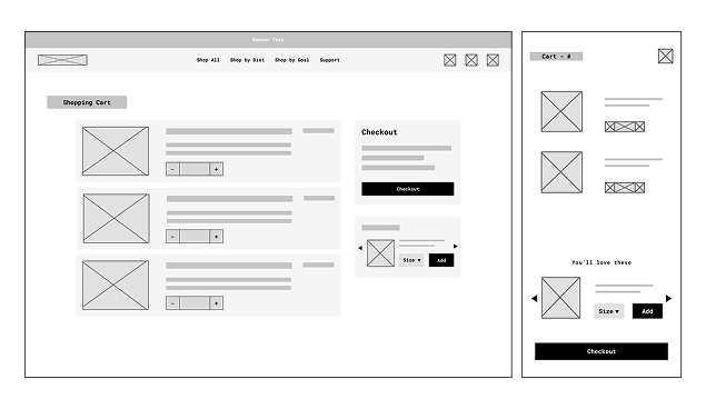
Cart Redesign
Expanded the cart view to full-screen on desktop, removed the auto-selected shipping protection, and suggested removing the rewards button from the cart, with the idea of placing it on the checkout page to reduce visual clutter.
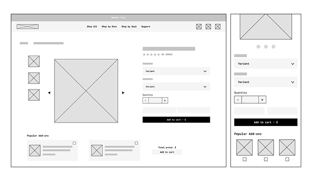
Add-On Integration Redesign
Related products are now integrated into the product page layout, removing the disruptive popup and allowing users to explore add-ons seamlessly without interrupting their shopping experience.
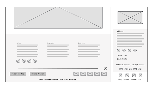
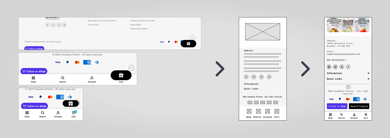
Footer Layout Optimization
The footer was reorganized to improve clarity. The rewards button was given a dedicated position instead of overlapping with other interface elements. On mobile, the scroll to top button is now fixed to remain visible and unobstructed.
Final Screens
Final desktop and mobile screens using the site’s original typography, icons, and layout conventions. These mockups apply the proposed adjustments while preserving the brand’s visual identity.
Updated Cart
Embedded Add-Ons
Refined Footer
From Problem to Solution
Small, targeted design changes resolved key usability issues. By moving from pain points to structured wireframes and mockups, the project delivered a smoother shopping experience without altering the site’s original identity.
Pain Point > Wireframe > Hi-Fi Mockup